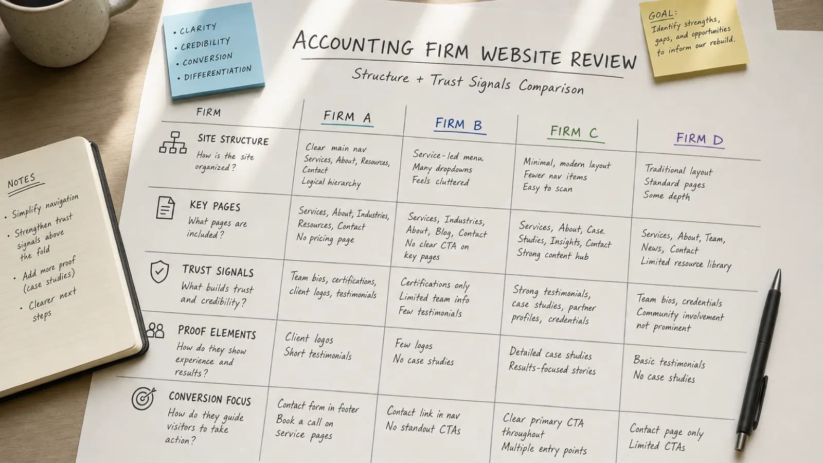
If you are planning an accounting firm website redesign, it helps to see what a strong website looks like before choosing a template or provider.
The problem is that many collections of accounting website examples offer little more than screenshots. A site may look polished, but appearance alone does not tell you whether it helps a prospective client understand the firm, trust its expertise, or take the next step.
A good accounting website connects design to a business purpose. It makes the firm’s audience and services clear. It presents evidence that supports its claims. It reduces the uncertainty someone may feel before discussing their finances with a new professional.
The five examples below take different approaches, from focused startup accounting to large multidisciplinary advisory services. The goal is not to copy them. It is to understand why specific choices work and decide which principles fit your own firm.
> Note: Website content and designs change over time. These observations reflect the public pages reviewed in August 2026.
What makes a good accounting firm website in 2026?
Before looking at individual examples, it helps to define what “good” means.

An effective accounting firm website should answer five questions quickly:
- Who does this firm serve? A visitor should recognize whether the firm works with people or businesses like them.
- What does the firm help with? Service names should be easy to find and explained in language clients understand.
- Why should the visitor trust the firm? Credentials, specializations, client proof, team visibility, resources, and a clear process can all reduce uncertainty.
- What makes the firm different? The answer may be a niche, service model, point of view, depth of expertise, or client experience—not an unsupported claim about exceptional service.
- What should the visitor do next? A consultation, contact, assessment, or other next step should be visible without making the website feel aggressive.
Strong visual design supports these answers. It creates hierarchy, separates ideas, makes pages easier to scan, and helps the firm feel current. It cannot compensate for vague positioning or unclear services.
1. Kruze Consulting makes its specialization immediately clear
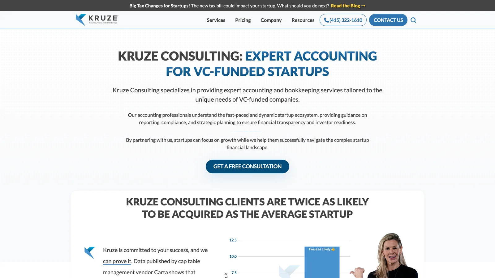
Kruze Consulting is an accounting, tax, and finance firm focused on venture-backed startups. That specialization is not hidden in a paragraph halfway down the homepage. It leads the experience.
Why the website works
The audience is specific. The homepage identifies venture-funded startups as the firm’s market. A founder does not have to determine whether the firm understands startup accounting, fundraising, or investor expectations.
The services support the positioning. Accounting, tax, finance, and related startup needs are presented as parts of a connected offering. This creates a more coherent picture than a long list of unrelated services.
Proof is integrated into the page. Client examples, outcomes, frequently asked questions, and educational material give visitors several ways to evaluate the firm before starting a conversation.
The content demonstrates expertise. Kruze has built a substantial library around startup finance and accounting questions. Those resources do more than attract search traffic; they show how the firm thinks about the problems its target clients face.
The lesson for smaller firms
You do not need Kruze’s content volume to apply the principle. Start by making your best-fit client unmistakable.
“Accounting and tax services for venture-backed startups” is more useful than “financial solutions for growing businesses” because the first statement helps the right visitor self-qualify.
If your firm serves several audiences, you can still create clear paths for each one. The homepage can introduce the firm broadly, then route visitors to focused pages for construction companies, healthcare practices, professional services firms, or individual tax clients.
2. Reconciled uses approachable language for outsourced accounting
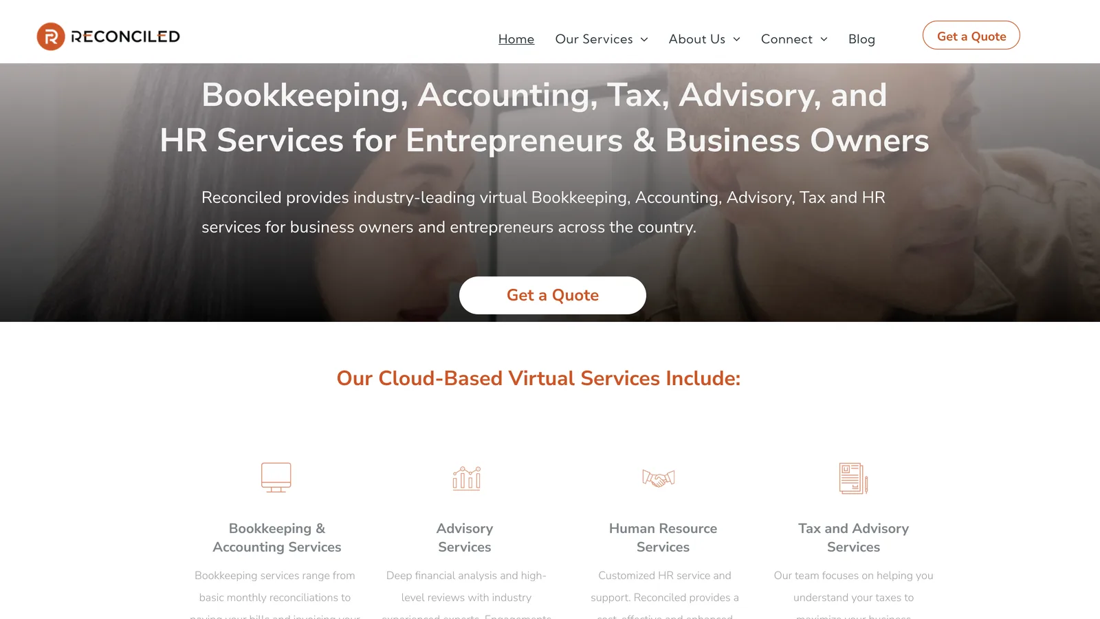
Reconciled presents virtual bookkeeping, accounting, and tax advisory services for small businesses. Its positioning makes outsourced financial support feel accessible rather than overly technical.
Why the website works
The offer is explained in client language. The site focuses on what small-business owners are trying to accomplish: organize their finances, receive dependable support, and make better-informed decisions.
Related services are grouped logically. Bookkeeping, accounting, advisory, and tax support sit within one broader relationship. This helps a visitor see how the service can expand as the business becomes more complex.
The tone lowers friction. Outsourcing financial work can feel risky. An approachable presentation can make the initial conversation feel less intimidating while still maintaining professional credibility.
The next step is visible. Visitors are given a direct path toward discussing their needs instead of being left to navigate a dense service catalog.
The lesson for bookkeeping and virtual accounting firms
Clarity does not require formal or technical language. In many cases, translating the service into the client’s day-to-day reality is more persuasive.
For example, a bookkeeping page can explain:
- what work the firm handles;
- what the client still needs to provide;
- how communication works;
- when reports are delivered;
- how the relationship can change as the business grows.
That information builds more trust than repeatedly describing the firm as accurate, reliable, or comprehensive.
3. Acuity organizes a broad offer around a clear operating model
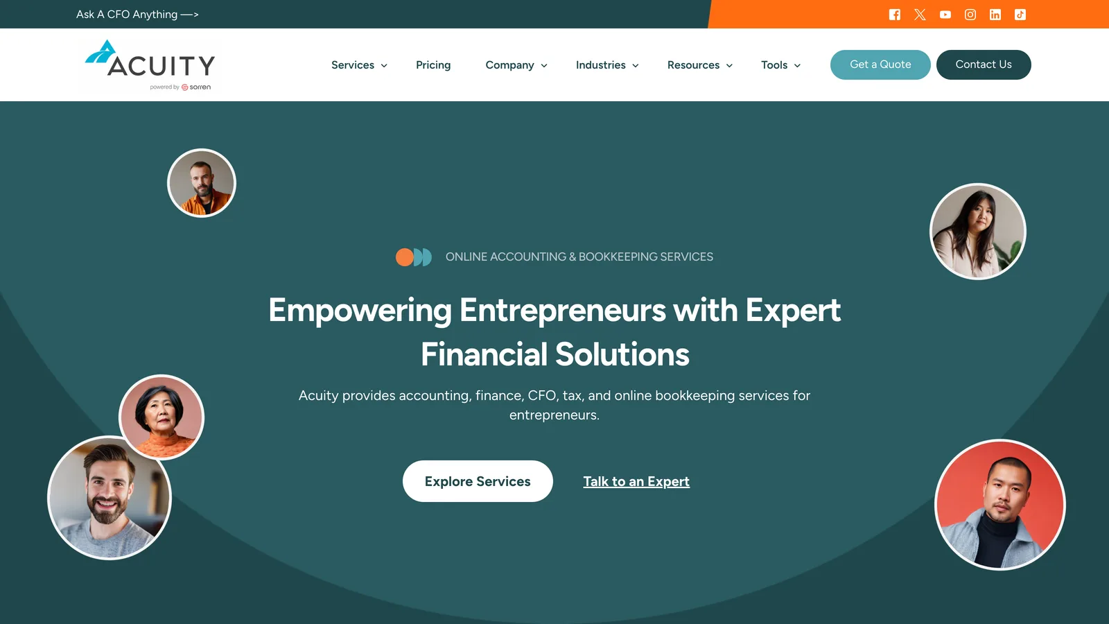
Acuity provides online accounting and bookkeeping services for entrepreneurs. Its homepage introduces the service through a combination of practical capabilities and a people-process-technology framework.
Why the website works
The main category is immediately recognizable. “Online Accounting & Bookkeeping Services” gives visitors a direct description of the offer before expanding into supporting details.
The service model is made tangible. Organizing the experience around people, process, and technology helps explain how the work gets done. This matters because prospective clients are not only evaluating the list of services; they are evaluating what it may feel like to rely on the provider each month.
The site supports different stages of growth. Visitors can understand that their needs may evolve from bookkeeping into more strategic financial support without having to decode an internal org chart.
Credibility is reinforced with specific proof. Client volume, recognition, and specialization content help substantiate the firm’s position. Proof works best when it is concrete and placed near the claims it supports.
The lesson for firms with several service levels
Avoid presenting every service as an equal item in one long menu. Organize services around a progression the client recognizes.
A small firm might use a structure such as:
- Get the books current.
- Maintain accurate monthly reporting.
- Prepare for tax obligations.
- Use the numbers to make better decisions.
This gives the service architecture a narrative. It also helps visitors identify the level of support they need now without assuming they must buy everything at once.
4. Aprio shows how a large firm can manage complexity
Aprio serves a much broader market, with services spanning tax, audit and assurance, advisory, risk, technology, wealth management, and specialized industries.
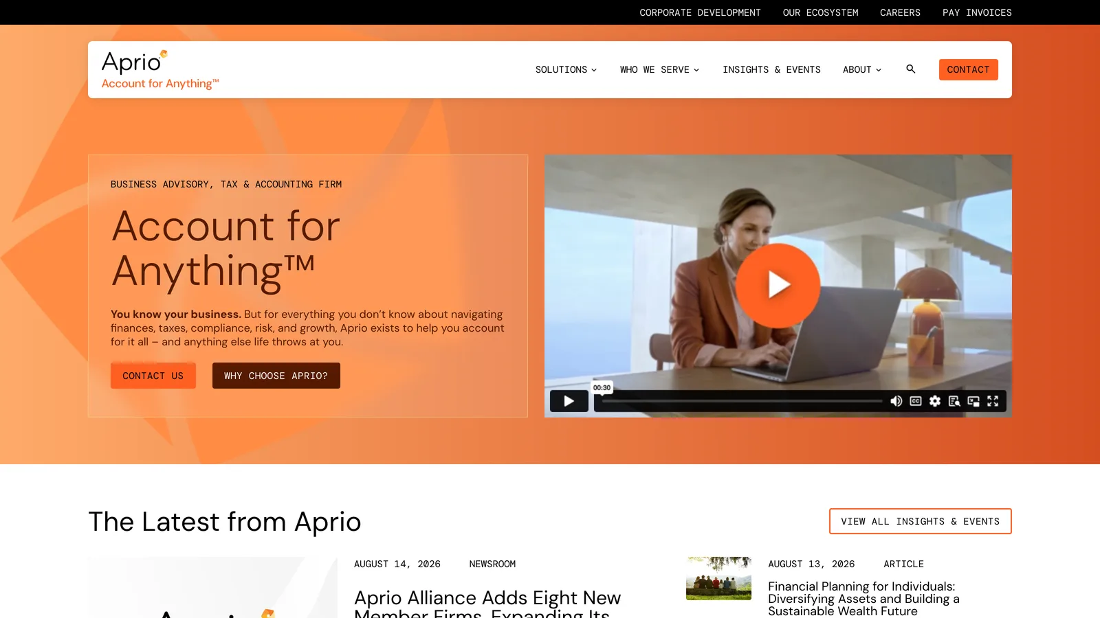
A large firm website faces a different challenge from a solo CPA website: it must communicate depth without overwhelming visitors.
Why the website works
A memorable central idea creates cohesion. The “Account for Anything” positioning gives the brand a recognizable point of view while the surrounding content explains the practical range of capabilities.
Complex services are grouped into understandable categories. Visitors can begin with a need—such as tax, audit, advisory, or risk—and move into more specific material from there.
Industry and service paths support different buying journeys. A visitor researching a technical issue may enter through an article or industry page, while another may begin with a broad service category. The information architecture accommodates both.
Resources contribute to authority. Articles, webinars, and timely insights demonstrate that the firm is active in the issues its clients are navigating.
The lesson for growing CPA firms
As your service list expands, navigation becomes a trust issue. If prospects cannot understand the relationship between your services, the firm can appear harder to work with than it really is.
Group services according to how clients think, not solely according to internal departments. Use overview pages to explain who each service is for, what problem it addresses, and where a client should begin.
A growing firm does not need to place every specialty on the homepage. The homepage should establish the firm’s value and help visitors choose the correct path. Deeper pages can carry the detail.
5. Anders balances professional authority with a more human presence
Anders presents advisory, audit and assurance, and tax services to businesses of different sizes. The site demonstrates how an established firm can communicate substantial expertise without making every page feel institutional.

Why the website works
The primary service areas are easy to identify. Visitors receive a manageable view of the firm’s capabilities before exploring specialties in more detail.
The messaging connects services to the client’s work. Rather than treating tax, audit, and advisory as isolated technical products, the site frames them as support that helps clients focus on their businesses.
The firm’s expertise feels connected to real people. Team visibility is particularly important for professional services. Clients are choosing people they may trust with sensitive financial information, not an anonymous software product.
The design leaves room for depth. An established firm may need to support numerous industries, insights, professionals, and service pages. A restrained visual system and clear hierarchy help that material feel organized.
The lesson for established local and regional firms
Professional does not have to mean impersonal. Team photography, individual biographies, clear contact details, and plainspoken explanations can strengthen authority because they show who will be doing the work.
A good biography should go beyond credentials. It can explain the professional’s areas of focus, the clients they tend to help, and how they approach the relationship. Credentials establish qualification; context helps a prospective client recognize fit.
What these accounting website examples have in common

These websites differ in audience, size, voice, and visual style. Their strongest shared qualities are structural rather than decorative.
Clear positioning before general claims
The more quickly a visitor recognizes the firm’s audience and capabilities, the less work they must do to decide whether to keep reading.
This does not mean every firm needs a narrow niche. It means the website should provide enough context to distinguish the practice from an interchangeable list of accounting services.
Services organized around client needs
Effective sites make it easy to understand what the firm does and how the services relate to one another. They avoid forcing visitors to interpret technical terminology without context.
Evidence placed close to important claims
A claim such as “trusted by growing businesses” becomes more credible when supported by client examples, testimonials, credentials, years of experience, industry depth, a transparent process, or useful educational content.
The proof should be relevant. A wall of association logos does not answer the same question as a detailed explanation of the firm’s experience with multi-state tax issues or construction accounting.
Multiple paths to build trust
Not every prospective client is ready to schedule a consultation during the first visit. Service pages, team profiles, FAQs, resources, case examples, and process explanations allow visitors to investigate at their own pace.
A visible, proportionate next step
Good calls to action are clear without appearing on every line. The next step should match the relationship being offered, whether that is scheduling an introductory call, requesting an assessment, or sending a question.
How to evaluate accounting website designs without copying them
Looking at competitors can be useful, but copying their page structure or language can reproduce the same weaknesses you are trying to escape. Their site may also reflect a different audience, business model, or marketing strategy.

Use examples to identify principles instead.
For each website you review, ask:
- Can I identify the target client from the first screen?
- Can I explain the firm’s main services after a quick scan?
- Is there a meaningful reason to choose this firm?
- Are important claims supported by evidence?
- Can I see the people behind the service?
- Does the site explain what happens after I make contact?
- Is the mobile experience easy to scan and navigate?
- Does each page lead to a logical next step?
- Does the writing sound specific to this firm?
- Does the design make the information clearer, or merely more decorative?
Keep notes about the underlying decisions—not just colors, fonts, and animations. A strong reference might be “the niche is clear in the headline” or “each service page answers who it is for.” Those observations are more useful than asking a designer to make your site look like another firm’s.
Also remember that public website copy may belong to the firm or its provider. Use your own client-owned materials as source material, then rewrite, refresh, and customize them around your positioning. Do not assume another company’s copy, images, or page designs are available to reuse.
Choose the right direction for your own accounting firm
There is no single visual style that every CPA, bookkeeper, or tax preparer should follow.
A founder-led practice may benefit from prominent personal photography and a direct explanation of the founder’s approach. A growing firm may need broader team imagery, clearer industry pathways, and stronger service architecture. A virtual bookkeeping company may emphasize process and communication, while an advisory firm may lead with expertise and specialized insight.
The right design is the one that helps your best-fit client answer three questions with confidence:
- Is this firm equipped to help someone like me?
- Do I trust the people and process behind the service?
- Is the next step clear and comfortable?
If you want a deeper breakdown of the elements above, see our guide to CPA website design.
That is what good accounting firm website design looks like in 2026: not simply modern, but specific, credible, and easy to act on.
Common questions
FAQs about this topic
What should a good accounting firm website include?
A good accounting firm website should include clear positioning, understandable service pages, team information, relevant trust signals, an explanation of the client process, contact details, and a visible next step. The exact page structure should reflect the firm’s audience and services.
How can an accounting website build trust?
An accounting website can build trust by making the firm’s specialization clear, showing the professionals behind the work, supporting claims with relevant evidence, explaining how the engagement works, and answering common questions before a prospect contacts the firm.
Should an accounting firm copy a competitor’s website?
No. Competitor websites are useful for identifying principles and market expectations, but copying their design or language can make a firm look interchangeable and may misuse content the firm does not own. Use client-owned materials and develop original positioning, copy, and visuals.
What pages does an accounting firm website need?
Most firms need a homepage, about or team page, service pages, and a contact page. Depending on the practice, industry pages, resources, FAQs, case examples, and individual professional biographies may also help prospective clients evaluate fit.
What is the best website style for a CPA or bookkeeper?
The best style depends on the practice. Founder-led firms may benefit from personal photography and a direct voice, while larger firms may need team-focused visuals and more detailed navigation. In either case, clarity, credibility, mobile usability, and service-specific information matter more than following a design trend.