
Searching for bookkeeping firm website examples can quickly turn into a tour of attractive homepages. That is useful for visual inspiration, but appearance alone does not explain whether a site helps a firm communicate its value.
A good accounting website has several jobs. It should tell visitors who the firm serves, explain what it does, establish credibility, and make the next step easy. The strongest sites arrange those pieces around a clear client decision instead of treating the homepage like a digital brochure.
This guide examines three real websites from bookkeeping, accounting, and advisory firms. These are not presented as perfect templates. Each one offers a practical lesson that a smaller CPA, bookkeeping, or tax firm can adapt without copying another company’s design or content.
What to look for in bookkeeping firm website examples
Start with clarity, not colors.
A prospective client should be able to answer a few basic questions after scanning the top of the homepage:
- What does this firm do?
- Does it work with businesses like mine?
- Why might I trust it?
- What should I do next?
That first screen matters because visitors make quick decisions. Nielsen Norman Group reports that users often leave pages within 10 to 20 seconds, while pages with a clear value proposition can hold attention longer (Nielsen Norman Group). A polished design cannot compensate for a vague opening message.
Look beyond the hero section as well. Review how the site organizes services, introduces its team, explains its process, supports claims, and moves visitors toward contact. If you are planning a focused site for a smaller practice, these website options for bookkeepers show how the same principles can be applied without building an oversized corporate site.
Bench makes the service immediately understandable
The Bench website opens with a direct description of the offer: a dedicated bookkeeper handles the books while the client uses software to access financial information. The page then reinforces that promise with a short list covering the bookkeeper, monthly books, year-end financials, taxes, and access to financial data.
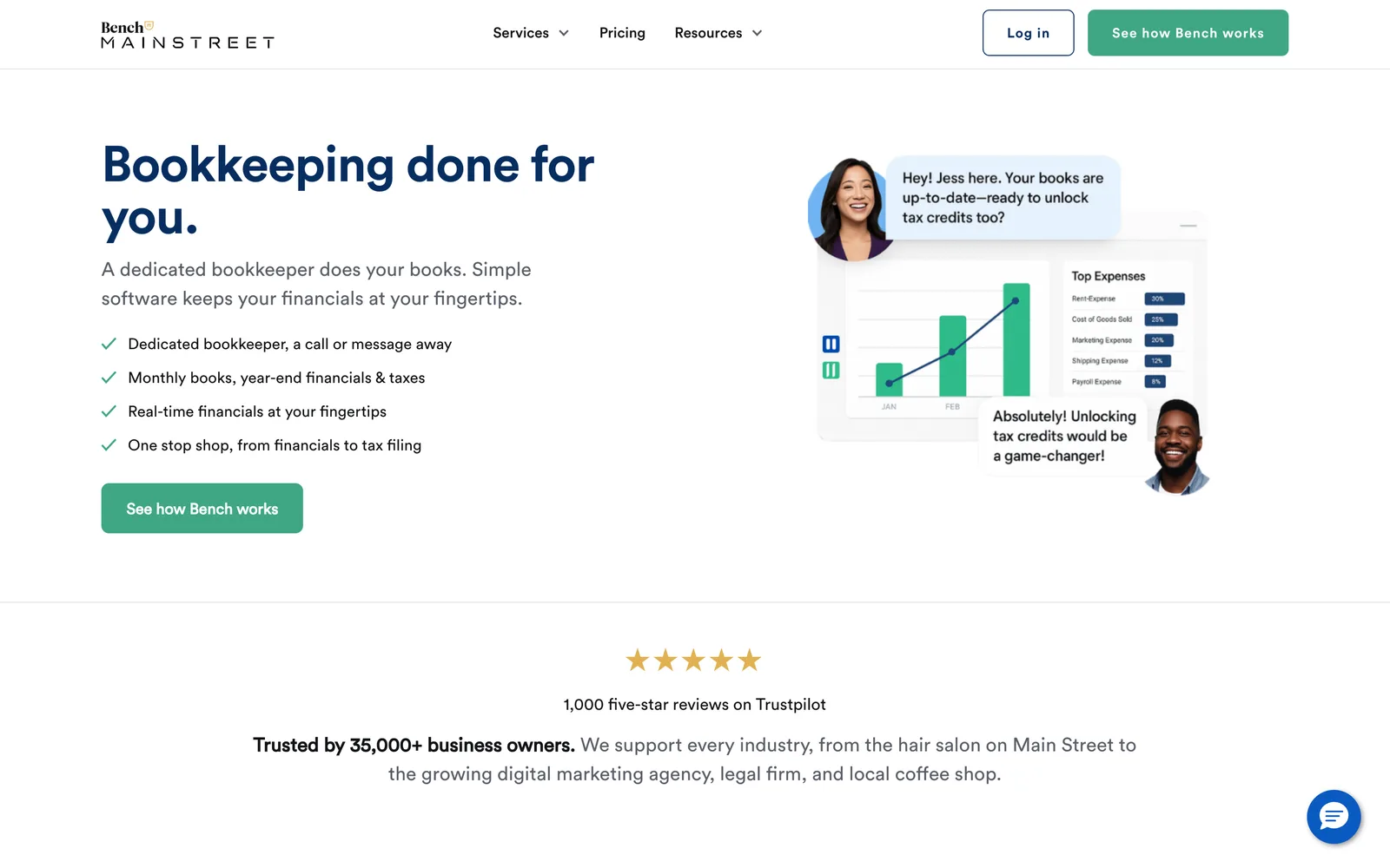
*Bench homepage example. Source: bench.co*
What Bench does especially well is remove ambiguity. A visitor does not need to decode broad language about financial confidence or strategic partnership before learning what the company sells.
The homepage also turns onboarding into a visible sequence. It explains the introductory call, the bookkeeper match, the initial work, and the ongoing monthly service. This makes an unfamiliar service feel more concrete. The visitor can picture what happens after taking action.
A smaller bookkeeping firm can adapt this approach by:
- Naming its primary service in the main headline or supporting sentence.
- Explaining whether clients work with a dedicated person or a wider team.
- Showing the first few steps after an inquiry.
- Separating routine bookkeeping from tax, cleanup, payroll, or advisory work.
The lesson is not to recreate Bench’s scale or layout. It is to make the engagement easy to understand. If a prospect needs to open several pages before learning how the relationship works, the homepage is leaving too much work to the visitor.
Acuity organizes services around client growth
The Acuity website presents bookkeeping as the foundation of a broader financial relationship. It connects bookkeeping with accounting, tax, controller, finance, and CFO support while speaking directly to entrepreneurs.

*Acuity homepage example. Source: acuity.co*
This is a useful example for firms with several service levels. Instead of displaying a flat list of disconnected offerings, Acuity explains how different forms of support fit changing business needs. The structure helps a prospective client understand that basic bookkeeping and strategic finance work solve different problems.
Acuity also commits to a defined audience. The repeated focus on entrepreneurs gives the site a point of view. The language, service descriptions, and calls to action feel connected because they are addressing a recognizable type of client.
For an independent firm, the same principle might produce a structure such as:
- Monthly bookkeeping for owner-led businesses.
- Catch-up work for firms with overdue records.
- Tax support for established clients.
- Advisory services for businesses preparing to hire or expand.
This is more helpful than placing bookkeeping, payroll, tax, and consulting in an undifferentiated grid. It tells visitors how the services relate to their situation.
The broader lesson is to organize the site around client needs, not the firm’s internal departments. That may mean grouping services by business stage, industry, recurring problem, or level of support. The right structure depends on the practice, but visitors should not have to understand accounting terminology before they can find the appropriate service.
EisnerAmper uses expertise as the main navigation path
The EisnerAmper website represents a much larger accounting and advisory organization, so its scope is not directly comparable to a local bookkeeper or small CPA firm. It is still instructive because it treats expertise and resources as central parts of the website rather than secondary material.

*EisnerAmper homepage example. Source: eisneramper.com*
The site has to serve visitors with varied needs across assurance, tax, advisory, outsourcing, industries, and business concerns. Its content structure helps people move toward relevant expertise instead of forcing every visitor through one generic service pitch.
A small accounting firm does not need the same volume of content. It can use the underlying idea on a more practical scale:
- Give each core service a focused page.
- Add industry pages only when the firm has meaningful experience in those industries.
- Publish resources that answer questions prospects actually ask.
- Connect articles to relevant services and next steps.
Google recommends organizing a site logically so users and search engines can understand how its pages relate to one another (Google Search Central). That makes clear site structure useful for both navigation and search visibility, although it does not guarantee rankings.
For a small firm, depth matters more than volume. A precise page about bookkeeping for construction companies can be more helpful than several broad pages that repeat generic descriptions of dependable service.
What these accounting websites have in common
The three sites look different, serve different markets, and operate at different scales. Their strongest shared quality is deliberate structure.
Bench leads with a concrete service and a visible process. Acuity connects services to stages of client need. EisnerAmper creates paths into specific expertise. In each case, the design supports the explanation rather than competing with it.
That leads to several practical principles for an accounting firm website:
Lead with a specific promise
Avoid opening with language that could describe any professional firm. State what you do, who you help, or which problem you solve.
Example: Monthly bookkeeping and catch-up support for growing service businesses.
Make services easy to compare
Visitors should understand the difference between recurring bookkeeping, cleanup work, tax preparation, payroll, and advisory support. Separate pages or clearly defined service cards can reduce confusion.
Show how the relationship starts
A short process section can answer questions that might otherwise delay an inquiry. Explain what the prospect submits, who contacts them, and what the initial conversation covers.
Use proof with context
Credentials, professional memberships, client feedback, team biographies, industry experience, and a real business address can all support trust. Select the proof that is accurate and relevant to your firm. Avoid filling the page with unsupported claims.
Keep the next step consistent
Choose a primary action such as requesting a consultation, sending an inquiry, or reviewing service details. Repeating one clear action is usually more coherent than presenting several competing buttons in every section.
You can browse accounting website designs to compare different ways these elements can be arranged while keeping the visitor’s decision clear.
How to use website examples without copying them
Examples work best as diagnostic tools. Do not begin by choosing another firm’s colors or rewriting its headline. Begin by identifying the communication problem that its design solves.
For every site you review, ask:
- What does the first screen make clear?
- How are the services grouped?
- Which trust signals appear before the main call to action?
- How does the firm explain its process?
- What information would matter to my clients but not to theirs?
Then translate the useful principle into your own positioning, services, client-owned materials, and visual identity. A specialist tax practice should not sound like a national bookkeeping platform. A founder-led bookkeeping business may benefit from personal photography and a direct biography, while a multi-partner CPA firm may need broader team and industry pages.
Your goal is not to assemble favorite pieces from unrelated websites. It is to create a consistent path from first impression to informed inquiry.
Choosing the right direction for your firm
Use real bookkeeping and CPA firm websites to understand what is possible, but judge each idea against your own practice.
If prospects regularly misunderstand your services, prioritize positioning and page structure. If referrals arrive but hesitate to contact you, strengthen trust signals and explain the process. If the site works on desktop but becomes difficult to use on a phone, address the underlying layout and navigation before adding more content.
A strong website does not need to imitate a large national company. It needs to present your firm clearly, credibly, and in a way that makes the next decision feel straightforward.
When you are ready to compare practical options, see Studio Ledger plans and pricing.
Common questions
FAQs about this topic
What should a bookkeeping firm website include?
Most bookkeeping firm websites need a clear homepage, focused service pages, an about page, contact information, and an explanation of the client process. Relevant credentials, team details, industries served, and accurate client feedback can strengthen trust.
Should a bookkeeping website show prices?
Publishing prices can help when services have a consistent scope and qualification process. Firms with highly variable engagements can instead explain what affects cost and provide a clear path to request an appropriate proposal.
Is a personal photo appropriate for a bookkeeping website?
A professional founder photo can work well for a solo or relationship-led practice because clients will know who they are contacting. A larger firm may benefit from team photography or a broader firm-led visual direction.
How often should an accounting firm website be updated?
Review the site whenever services, staff, credentials, contact details, or positioning change. It is also sensible to check forms, mobile usability, links, and key service pages at regular intervals.
Can a small bookkeeping firm use ideas from a large accounting website?
Yes, but the useful part is the principle rather than the scale. A small firm can adopt clearer navigation, stronger service organization, or better trust signals without copying another company’s wording, design, or content.