Why first impressions matter
When a new prospect lands on your site, they are trying to answer one question quickly: Can I trust this firm with my finances?
If the site feels dated, cramped, generic, or unclear, that doubt appears before they read your services or meet your team. The work behind the firm may be excellent. The website still failed its first job.
The 5 signs your accounting website looks outdated
1. Mobile issues
A modern CPA website has to work cleanly on a phone. If buttons are hard to tap, sections stack awkwardly, menus feel buried, or forms are painful to use, prospects assume the firm is behind before they ever call.
2. Tiny text
Small, dense copy makes a firm feel older than it is. Modern accounting websites use readable type, clear spacing, and short sections that can be scanned quickly by busy business owners.
3. Generic stock photos
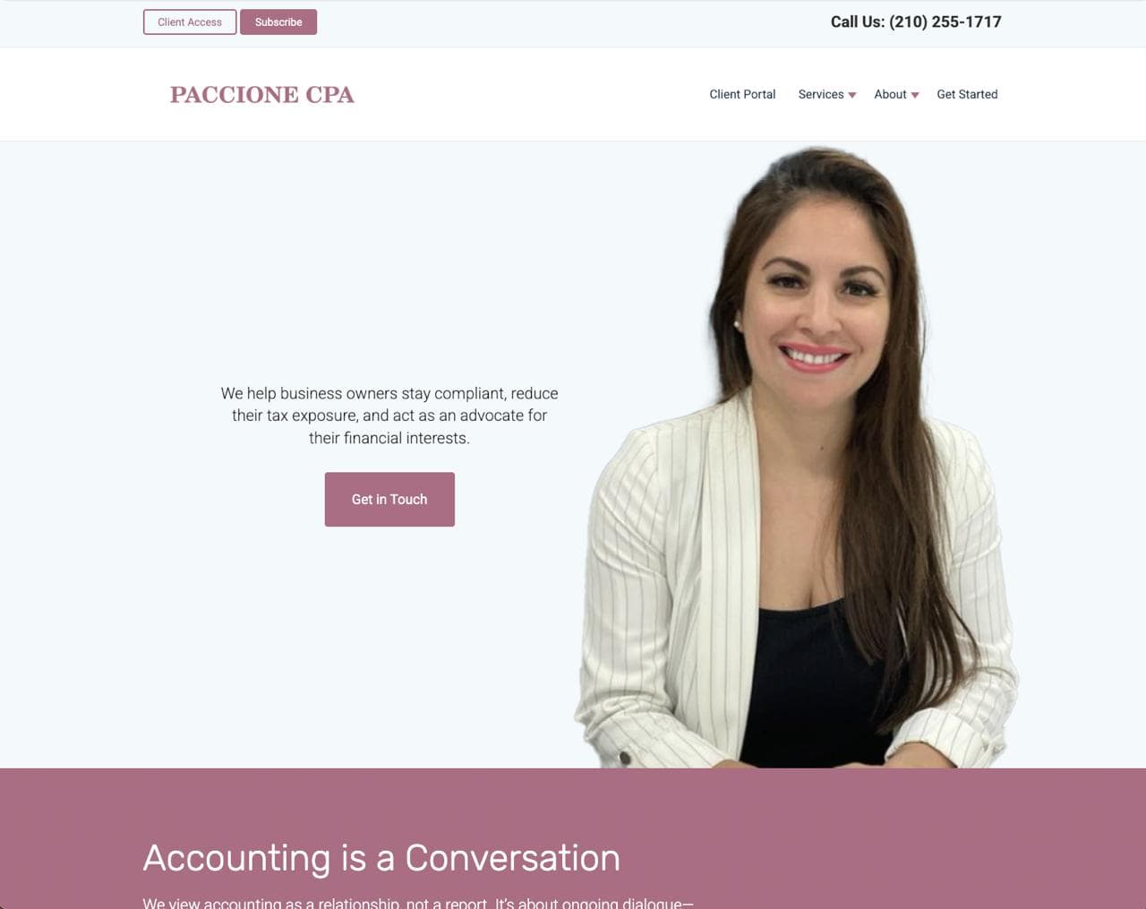
Handshake photos, calculator closeups, and anonymous business people do not create trust anymore. A better site uses founder presence, real team imagery, office details, or polished visuals that support the firm's positioning.
4. Slow speed
A slow site feels neglected. If the first page takes too long to load, prospects may leave before they ever understand what the firm offers.
5. No clear CTA
"Contact Us" is better than nothing, but it often leaves the visitor doing too much work. A stronger CTA tells them exactly what to do next and what happens after they click.
Examples:
- Schedule a 20-minute intro call
- Request a tax review for your business
- Start your onboarding — we'll follow up within one business day
More examples
A redesign does not have to make an accounting firm look flashy. The goal is to make the firm feel current, trustworthy, and easier to choose.

For people who want to keep reading
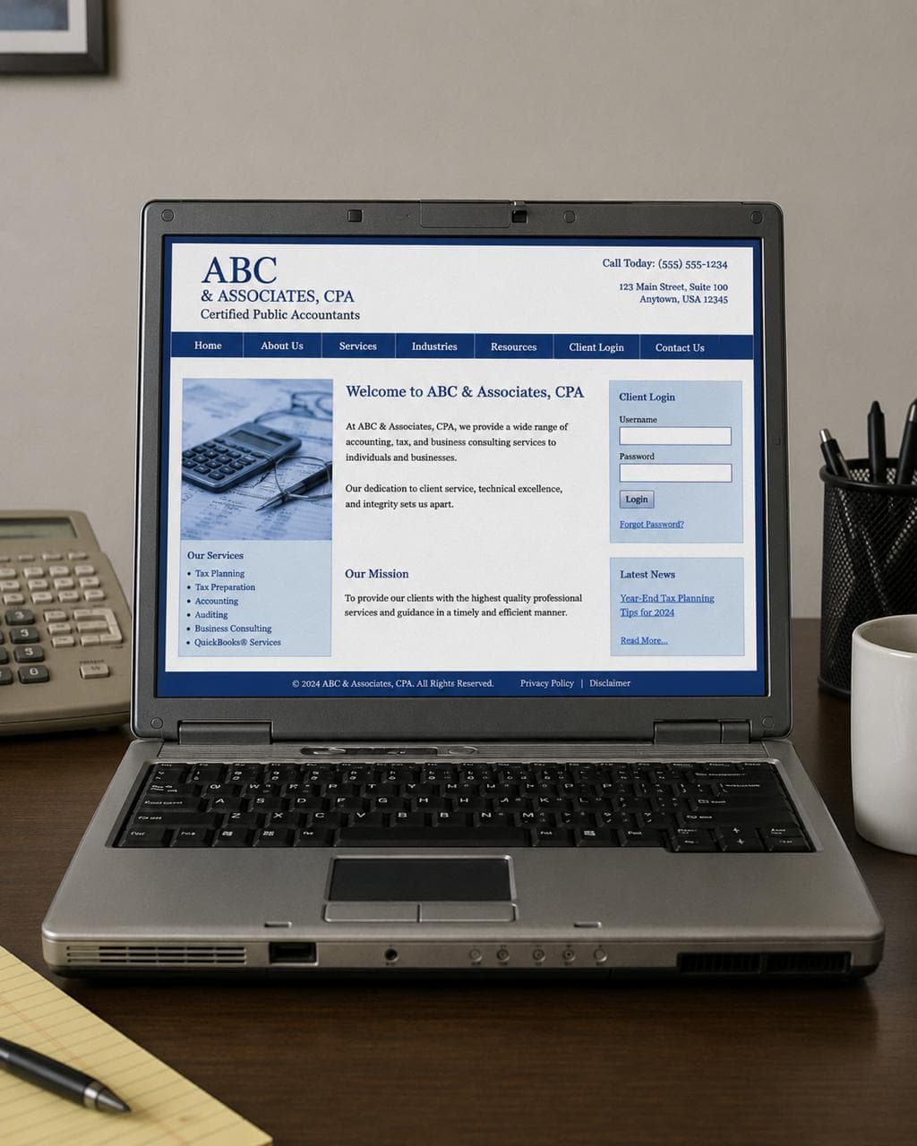
A dated accounting website is not always one built in 2009. Plenty of firms refresh their sites every few years but carry the same structural problems forward into a newer template.
The pattern usually looks like this: a welcome headline, a list of services, a stock photo, and a contact form at the bottom. It presents the firm without positioning it. It describes what the firm does without explaining who it is for or why that matters.
That structure made sense when having a website at all was the differentiator. Now every firm has one. The question is whether yours does any actual work.
Old headline vs. modern headline
The most common homepage headline in accounting is still some variation of:
"Welcome to [Firm Name] — Trusted Accounting Services"
It is not offensive. It is just not useful. A visitor who does not already know your firm learns very little from it.
Compare:
- Old: "Welcome to Harrison & Associates, CPA"
- Modern: "Year-round accounting support for small service businesses that are done scrambling at tax time"
The second version will turn away some visitors. That is the point. The ones who stay are far more likely to be a fit.
Old services vs. modern services
Old sites list services like a directory:
- Tax Preparation
- Bookkeeping
- Payroll Processing
- Business Consulting
A modern services section connects each service to the situation a client is actually in:
- Bookkeeping — Clean, organized records so decisions are not based on guesswork.
- Tax planning — Strategic preparation year-round, not a reactive filing sprint.
- Payroll support — One less administrative weight on the owner's week.
The work may be the same. The framing makes it feel like it was built for someone, not just listed for completeness.
Old trust vs. modern trust
Accounting is one of the highest-trust professional relationships a business owner has. On old-style websites, trust is often assumed: credentials appear somewhere in the footer and the firm considers the matter settled.
Modern accounting sites build visible trust before asking for anything:
- Founder or team presence
- Client reviews near decision points
- A clear process for what happens after someone reaches out
- FAQs that answer real buying questions
- Simple, repeated calls to action
None of this is complicated. Most of it is intentional placement of things the firm already has.
Final CTA
If your current site has mobile issues, tiny text, generic imagery, slow loading, or no clear next step, it may be costing you good-fit prospects before they ever contact you.
Studio Ledger designs are built for accounting firms that want a more credible first impression without a long custom agency process.