Key takeaways
- The fastest website improvements usually come from fixing the hero message, service clarity, trust placement, CTA, and visuals.
- Each mistake should be reviewed as a conversion problem, not just a design preference.
- A one-hour homepage audit can reveal the first fixes to make before a full redesign.
A lot of accounting websites do not need a full strategy retreat before they improve. They need a focused audit of the places where prospects get confused, hesitate, or fail to understand the next step.
This checklist is intentionally tactical. Use it to review the homepage, service pages, and contact path on your current site. If you only have a few hours this week, fix the items that make trust and action harder.
For a broader explanation of why this matters, read our guide on why outdated accounting websites cost firms better clients. This article is the hands-on version.
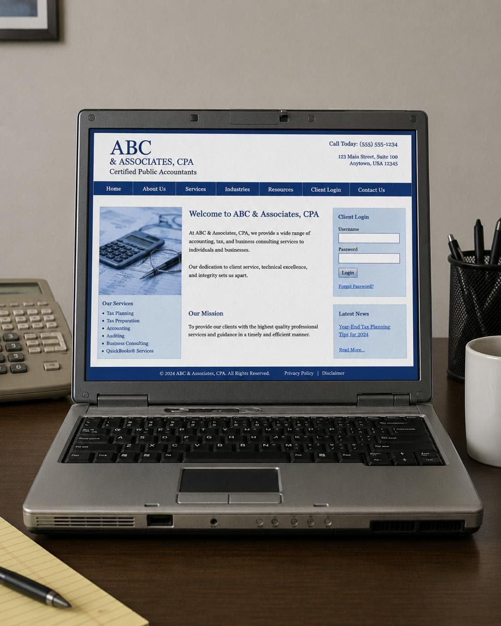
Mistake 1: The hero message is too generic
What it looks like
The top of the homepage says something like “Professional accounting solutions,” “Welcome to our firm,” or “Accounting, tax, and advisory services.” The message is accurate, but it could describe hundreds of firms.
Why it hurts trust and conversions
Prospects scan quickly. If they cannot tell who the firm helps or what kind of problem it solves, they have to keep digging. That extra work creates friction before the first call.
A better version
Weak: “Accounting services for individuals and businesses.”
Better: “Year-round bookkeeping and tax support for growing service businesses.”
The better version gives the visitor a client type, a service context, and a reason to keep reading.
What to fix this week
Rewrite the homepage headline and subheadline so they answer three questions:
- Who is this for?
- What do you help them with?
- What should they do next?
If you want a simple structure to compare against, review the Studio Ledger designs and look at how the first screen frames audience, value, and action together.
Mistake 2: Services are listed like a directory
What it looks like
The services page has a short list: bookkeeping, payroll, tax preparation, advisory, consulting. There is little explanation of who each service is for, what is included, or what outcome the client should expect.
Why it hurts trust and conversions
A prospect may know they need help, but not know which service label matches their situation. A bare list makes them translate your offer on their own.
A better version
Instead of only saying “Bookkeeping,” add context:
- Monthly bookkeeping for service businesses that need clean numbers before making decisions
- Tax preparation for owners who want fewer surprises and a more organized filing process
- Advisory support for firms that want practical financial guidance, not just reports
What to fix this week
Pick your three most important services and add one plain-language sentence under each. Explain the client situation, the outcome, and the next step. If you are rebuilding pages, the what’s included page shows the kinds of service and setup structure a modern accounting website should plan for.
Quick next step: Before redesigning the whole site, compare your homepage and top service page against Studio Ledger’s accounting website designs. Look for the first place a prospect might ask, “Is this firm actually for me?”
Mistake 3: Trust signals are buried too low
What it looks like
Credentials, reviews, process details, team information, or FAQs exist somewhere on the site, but visitors have to hunt for them. Sometimes the only trust signal is a small footer line or an About page link.
Why it hurts trust and conversions
Accounting buyers are risk-sensitive. They are choosing who may handle taxes, books, payroll, financial decisions, or private documents. Trust should not appear only after five clicks.
A better version
Place proof near decision points:
- Credentials near the first service explanation
- Reviews near the consultation CTA
- Process steps before the contact form
- FAQs before the final call to action
- Founder or team presence on the homepage and About page
What to fix this week
Add one trust block to the homepage. A simple version can include credentials, who you serve, a three-step process, and one review or client outcome. For more detail, see our guide to accounting website trust signals.
Mistake 4: The CTA is vague or hidden
What it looks like
The site relies on “Contact us,” a tiny menu link, or a form that does not explain what happens after someone submits it.
Why it hurts trust and conversions
Visitors need a clear path. A vague CTA makes them wonder whether they are booking a consultation, asking a general question, requesting a quote, or starting an intake process.
A better version
Use action language that matches the firm’s process:
- Schedule a consultation
- Request a bookkeeping review
- Start your tax prep intake
- Ask about monthly accounting
- See if we are a fit
What to fix this week
Choose one primary CTA and repeat it in the hero, after the services section, and near the bottom of the page. If the firm is ready to take inquiries, link the CTA to a focused next step like Start here rather than a vague general page.
Mistake 5: The visuals make the firm feel anonymous
What it looks like
The site uses the same generic accounting imagery as everyone else: calculators, handshakes, stock conference rooms, fake dashboards, or smiling laptop photos that do not say anything specific about the firm.
Why it hurts trust and conversions
Visuals shape perceived professionalism. Generic visuals make the firm feel interchangeable. Low-quality visuals can make the firm feel less current than it actually is.
A better version
Use visuals that support a trust strategy:
- Founder-led photo direction for solo CPAs and relationship-driven practices
- Firm-led brand imagery for teams that want a more established feel
- Clean website sections that show services, process, and next steps
- Professional workspace details that feel specific, not stock
What to fix this week
Remove the weakest stock image from your homepage and replace it with something more intentional. If you are not sure which visual direction fits, read founder-led vs firm-led accounting websites.
A simple one-hour audit
Open your homepage and answer these questions without scrolling for more than a few seconds:
- Does the hero say exactly who the firm helps?
- Is the primary service or outcome clear?
- Is there a specific CTA above the fold?
- Is at least one trust signal visible early?
- Do the visuals feel like this firm, or like any firm?
If the answer is no, those are the fixes to prioritize first.
FAQ
What is the most common accounting website mistake?
The most common mistake is generic positioning. If the homepage could describe any CPA firm, it does not help the right prospect feel confident that the firm is a fit.
Should a CPA firm fix copy or design first?
Start with the message. A clearer headline, better service explanations, visible trust signals, and a stronger CTA can improve the site quickly. If the design still feels dated or hard to use after that, a redesign may be the better next step.
How often should an accounting firm audit its website?
Review the homepage and contact path at least twice a year, especially before busy season or before running ads. The firm’s services, audience, and availability can change faster than the website does.
Common questions
FAQs about this topic
What is the most common accounting website mistake?
The most common mistake is generic positioning. If the homepage could describe any CPA firm, it does not help the right prospect feel confident that the firm is a fit.
Should a CPA firm fix copy or design first?
Start with the message. A clearer headline, better service explanations, visible trust signals, and a stronger CTA can improve the site quickly. If the design still feels dated or hard to use after that, a redesign may be the better next step.
How often should an accounting firm audit its website?
Review the homepage and contact path at least twice a year, especially before busy season or before running ads. The firm’s services, audience, and availability can change faster than the website does.